Note: this document is meant to be all things for all people, from novice to expert alike. In practice, that means that there will some parts that are hard for the novice to digest and other parts tediously covering basic information for the experts. Ideally, I’d create different documents for different audiences, but I don’t even have time now to properly edit this single one. So my apologies, and do please keep in mind that you’re not the only person I’m addresing here — whomever you are.
Photographers are constantly struggling to get the “right” color in their work. Oftentimes, what is desired is not a perfect reproduction of the colors of the objects in the scene, but a somehow more “pleasing” color. At other times, such as in fine art reproduction, the challenge actually is to exactly reproduce the colors of the original objects.
Contrary to popular belief, modern digital cameras are actually capable of doing a very good job of (almost) exactly reproducing color — enough so that it is possible to make a photograph of a work of art, print it, and show the two side-by-side to the artist…and have to wait a while for the artist herself to be able to point out the differences.
There are limitations, to be sure, mostly with the limits of the printer. No unmodified commercially-avaialble printer can print fluorescent or metallic or iridescent inks, for example, and those cannot therefore be faithfully reproduced. Similarly, some artists uses paints that are more saturated and / or darker than some inkjet printers are capable of printing on the desired paper. However, the rest of the image can be copied for the artist to hand-apply the special colorings. And, in a great many cases, if the difference between the printer’s gamut and that of the artwork isn’t too extreme, the resulting print is “good enough” as is.
Critical to getting a good print is getting a good photograph, and critical to getting a good photograph is the post-processing. The problem faced by so many photographers is that the tools used for post-processing are overwhelmingly designed for photographers looking for “pleasing” color, and are further generally designed to mimic analog film. While this is good for the overwhelming majority of photographers who do find those results pleasing, it’s disastrous for those who, whether aesthetically of necessity, are after much more strict realism.
This Web page, therefore, documents my own approach to the problem.
First, a bit of background introduction to help put things in proper context.
In most modern digital cameras, the sensor is a type of semiconductor divided into a grid such that light that reaches one of the cells in the grid (a photosite, which maps to a pixel in the image) causes an accumulation of electrons. The more light that reaches the photosite, the more electrons accumulate and the higher the voltage of that cell. When the exposure is over, the camera reads the voltages of all the photosites, converts each to a digital number, and saves those numbers to a file the memory card. When shooting RAW, the file is very close to nothing more than just a giant spreadsheet with all those numbers. When shooting JPEG, the numbers are significantly modified before being written to a JPEG image file. Since post-processing options are very limited for JPEG and since those numbers are modified in much the same way as I’m about to describe for RAW, I’ll not mention JPEG processing again.
The recording process is very linear. If a certain amount of light will cause a certain voltage to accumulate on a photosite, twice as much light will double the voltage — and the number recorded to the file will be twice as big. Photographers are already very familiar with this type of linearity; anything that would increase the exposure by one stop will double the light, thus double the voltage, thus double the number recorded. Similarly, decrease the exposure by one stop and the number recorded is halved.
There are practical limits to how many times you can double or halve the exposure. In particular, the photosites have hard limits on how much of a charge they can accumulate; more light falling on the photosite after it’s reached its maximum charge doesn’t increase the charge any further, much as pouring more water in a glass that’s already full doesn’t fill the glass any more.
At the dark end, there will always be some static or noise in the electronics, and that noise manifests itself as very small random fluctuations in the voltages in the photosites which in turn results in very small random numbers added to the file. A very small number added to a very big number doesn’t change the big number very much, but a very small number added to another very small number (such as is recorded by a photosite not exposed to much light) can result in a very dramatic change. There are various ways of increasing the signal-to-noise ratio of faint signals, with the most apparent to the photographer being the application of analog electronic amplification to the signals recorded by the photosites before they’re converted to digital numbers; the photographer calls this the ISO setting. Increasing the ISO setting by one stop applies enough amplification (by a similar mechanism as turning up the volume knob on your radio) to double the voltage between the photosite and the digital converter. Of course, the louder you turn up your radio the more it distorts, and the same thing happens in the camera; however, in practice, the amplification is remarkably clean for a great many doublings.
In all of this discussion, I have so far entirely avoided the question of color. In modern cameras, each of those photosites has been individually fitted with either a red, green, or blue filter and thus mostly only allows light of the corresponding color to pass through to the underlying photosite. The Wikipedia article on the Bayer filter has a good introduction on how the process works. The details aren’t too important for this discussion. What is important to understand is that the software that develops the RAW file performs a process called, “demosaicing,” that aligns and interpolates the multiple single-color pixels into the much more familiar three-color pixels — and that it’s those three-color pixels we’ll be dealing with from here on out.
With that background on how the camera functions out of the way, a bit more background on how numbers and color interact is in order.
We’ve established that the numbers in a RAW file directly corressponds with the voltages recorded by the photosites. And, though we’re going to make very good use of those numbers, they don’t by themselves tell your monitor or your printer anything meaningful. If your monitor had tiny red, green, and blue lightbulbs with each light being the exact same color as the filters in your camera arranged in the exact same pattern as your camera and if there was a linear digital-to-analog converter that would translate the numbers from the file back into voltages that would light up the tiny lightbulbs in the exact same way, then you’d see exactly what your camera saw. And, though what actually happens is quite similar in principle to what I just described, in practice, it’s nowhere close. And printers are, obviously, even more different.
Originally, digital computer image files rather naïvely assumed that all computer monitors were identical, and so the files were simply instructions to turn on a given pixel by so much red, so much green, and so much blue. Any color correction was, as on old TVs, expected to be done by fiddling with the knobs on the monitor until it didn’t look so bad.
Such a situation is obviously untenable.
Though the files themselves today are still pretty much the same type of absolute numbers, they are “tagged” with an ICC profile. The profile provides a map that identifies a particular combination of RGB values into an absolutely-defined color, and vice-versa. The absolute colors are identified using a “Profile Connection Space,” or, “PCS,” and either Lab or XYZ color are most commonly used.
Lab space is most easily visualized as what you might experience in an ideal proofing booth, with a particularly-specified color source (D50 is its name) at an exact brightness an exact distance above the print. A perfectly white piece of paper will have an L* value of 100; a perfectly black patch of carbon nanotube paint will have an L* value of 0; and a perfect photographic gray card will have an L* value of 50. In all three cases, the a* and b* values will be 0. The more red, the higher the a* values; the more green, the lower (increasingly negative) the a* value. Similarly, the more yellow, the higher the b* value, and the more blue the lower (more negative) the b* value.
The Lab values are absolute; if you make the bulb brighter or hold the paper closer to it, the L* value will go above 100; dim the light or move it farther away, and the paper’s L* value will go below 100.
However, when used as a Profile Connection Space, it is assumed that the picture is being viewed in that mythical perfect viewing environment — and, correspondingly, the largest numbers in the RGB value are mapped to L*=100, and zero is mapped to zero in both instances.
If what you’re after is as accurate a reproduction of the original scene as you can possibly get, then your goal as a photographer is to take a photograph such that, when developed, the Lab value corresponding to the RGB value of the image’s profile matches the Lab value of that object when viewed in the idealized light booth. That is, the (perfect) white paper will have maximum values in the RGB file which will map to L*=100 a*=0 b*=0; the black hole will come out as all zeroes; and the photographic gray card will have values in the middle that map to L*=50 a*=0 b*=0. This mapping is made partly by getting the exposure perfect and partly by an input ICC profile that maps the numbers in the RAW file to the Profile Connection Space; the RAW development software then translates the camera-generated RGB values to the PCS, and then uses the ICC profile of your favorite working space (sRGB or AdobeRGB or ProPhotoRGB, for example) to map from the PCS to those RGB values.
When you print the file, that combination of printer and paper should have its own ICC profile, and a similar process happens in reverse: the RGB values of your working space get translated to the PCS which gets translated into whatever numbers your printer needs to lay down ink such that, if you were to put the original and the print side-by-side in the same ideal light booth, they’d look identical.
Your monitor as well should have an ICC profile associated with it so that you can see accurate colors (scaled to the monitor’s brightness) as you edit the file.
Imagine for a moment again that we’re not dealing with color but only black and white. As such, since the camera behaves in a linear manner, all we have to do is adjust the exposure so that, for example, our 18% gray card gets recorded in the digital file as a value that’s 18% of the maximum value the sensor can record. All the other values will fall into place — again, because something that reflects, for example, 36% of the light that hits it will cause twice as many electrons to build up on the photosite and record a number that’s twice as big in the digital file, which will be 36% of the sensor’s maximum value. The perfectly white sheet of paper will just perfectly exactly fill up the photosites to maximum capacity.
Actually getting that perfect exposure directly in the camera is possible (to within a very small margin of error), but it’s not necessary. Because of the linearity of the camera, if we were to underexpose the scene by an entire stop, all we’d have to do is double the numbers in the file to restore them to their proper values. If they’re 10% too low, increase them by 10%, and so on. An alternative way of looking at it — just as an alternative way to divide by three is to multiply by 1/3 — is to figure out what value the white paper actually got recorded as, set that as the new maximum value, and set everything brighter than that to the new maximum value exactly as if it had overexposed in the first place.
As a side note, this process obviously throws away highlight detail that the camera recorded. For fine art reproduction, this mostly isn’t a problem. If the image you make of a work of art actually does have "brighter than white" colors in it, it means that it has fluorescent dyes or is thowing specular highlights. If the former, you’re not going to reproduce the fluorescence no matter what; in the latter, either your lighting is not set up properly or you’re dealing with a metallic surface — which, again, you’re not going to reproduce. For general-purpose photography, you’re again not going to be able to make a print with, for example, brighter-than-white specular highlights or light sources or the like. There are, of course, alternatives. You can, for example, compress the highlights, sacrificing some of the contrast (and therefore detail) in that part of the image in exchange for laying down at least some ink; this is what "highlight recovery" features of most RAW processing software does. You can render the entire image darker to preserve highlight contrast, making for a dramatic rendition. Or you can create a composite image with two different renderings, one exposed normally and the other underexposed for the highlights; this is what "tone mapping" or "High Dynamic Range" software does — and it’s also the function of a neutral density filter. Generally, the best results are obtained either through subtle use of highlight recovery or by careful manual composition of different exposures.
In a proper rendering of the image, that gray card will have an 18% value in all three of the color channels. However, no camera on the market today will actually record the scene in such a manner. There are two variables at play: the different transmissive qualities of the color filters over the photosites, and the color of the light itself.
Traditionally, white balancing is something of a black art, much too arcane to discuss here. The complexity is most unfortunate, because — again, thans to the linear nature of the camera’s response — all that is necessary is to independenly normalize the exposure of each of the color channels. In practice, the blue channel is generally about a stop underexposed compared to the green channel, and the red channel is about a stop and a half underexposed compared to the green channel. If you separately determine what factor you need to multiply the values by (or, alternatively, separately determine what the white point is for each), then, when you combine the channels, all neutral objects will have equal values for each of the channels and thus will be rendered neutrally.
That’s all that’s actually going behind the scenes when you fiddle with the color temperature and tint sliders (or whatever tools your RAW processing software presents to you). The programmers have "helpfuly" hidden from you the fact that the three channels aren’t exposed the same, and they’ve reconstructed all the old paradigmes that film, which behaves differently, used to use for its color balance challenges.
After proper white balancing, the neutral tones in a RAW file will be (close to) perfect, but the saturated colors have no meaning without an associated ICC color profile for all the reasons discussed above. The last step in RAW development, therefore, is simply to tag the image with the proper ICC profile and convert it to your favorite working space. The profile, however, is only effective if assumes that exposure and white balance have already been properly normalized. For optimal performance, the profile should also take into account the source of illumination as well as anything else that can alter the color balance. Even if the camera’s sensor is perfectly linear, unless the light source is a perfect match for the D50 reference illuminant, there will not be a perfect one-to-one match between the light that reaches the camera and the light that would have reached the camera in the idealized viewing booth — and the camera, of course, will record what it actually sees and not what it would have seen. The ICC profile is designed to correct for these discrepancies.
As Ye Ole Yolk goes, a picture is worth a thousand words — and, I’m afraid, I’ve already given you more than a mere thousand so far. Now, it’s time to step through the actual process.
…or, rather, a modified form of the process. Just to demonstrate what’s actually going on at every step of the way, I’m going to do things here that I never would in real processing because there are much better tools than the ones I’ll demonstrate here. But the tools I’ll demonstrate with are either much more familiar to photographers or much more transparent and, either way, make much more obvious what they’re doing. Later, I’ll show how I actually do things — which is a much simpler process.
If you’d like to follow along, you can download the original RAW file I used. The inline images that follow have been scaled down for presentation. Since this is about color, not detail, all I’ve done is downsample the images. Normally, there would be at least a bit of sharpening as part of the workflow for optimal presentation, but that’s not what this is about, and a soft image demonstrates these points as well as a sharp one without complicating or confusing the issue.
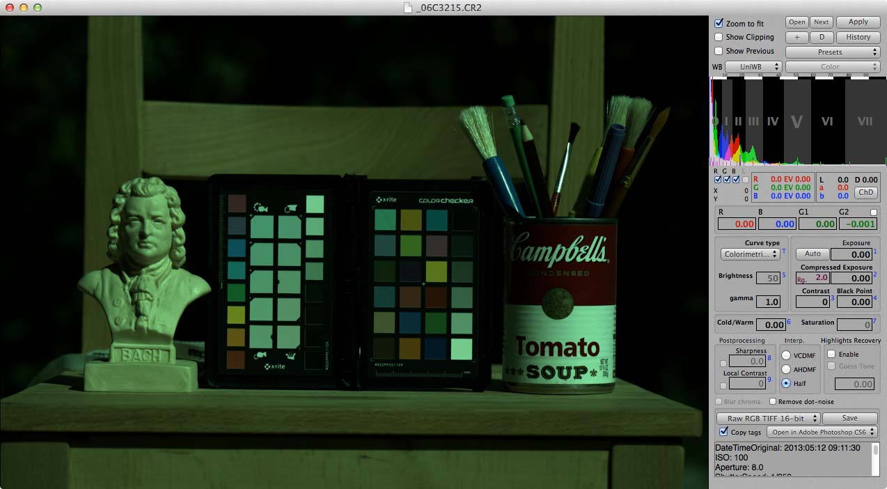
The very first step is to start with a simple dump of the data off the sensor into an image file. There generally isn’t any way to do this with popular RAW development software, but many of the "alternative" applications have a way to turn off all post-processing other than demosaicing. The great-granddaddy of such options is David Coffin’s dcraw, which is what I’ll use for this exercise. It’s not what I regularly use — as I described above.
dcraw is a command-line application, so you have to actually type the name of the program and what you want it to do. It then silently does its thing and saves the result to a TIFF file.
The command I’ve used to process the above-lined RAW file is this:
dcraw -r 1 1 1 1 -M -H 0 -o 0 -4 -T _06C3215.CR2
Now, before you start to panic, don’t worry; you don’t need to use dcraw and I don’t. You also don’t need to understand what all those options do, other than to know that it reads the data in the RAW file and writes out a TIFF whose numerical values match those in the RAW file. Imagine loading the RAW file into a spreadsheet. Normally there’d be all sorts of functions applied to those numbers before saving them back to a TIFF; with that line above, the same numbers get written to the TIFF as what was in the original RAW file.
(And, should you care, "-r 1 1 1 1" means, "do no white balancing"; "-M" means, "don’t use any embedded color matrix"; "-H 0" means, "don’t try to reconstruct highlights"; "-o 0" means, "don’t translate to and embed any color space"; "-4" means, "don’t do any automatic levels adjustment, write a 16-bit file, and use a linear (unmodified) gamma encoding"; and "-T" means, "output to TIFF rather than PPM.")
As I noted above, the data in such an image is a bit meaningless without an associated color profile. And, indeed, one could create a color profile that would correctly map this data to an absolute color space and then convert the data to, say, your monitor’s color space. But it is informative to omit all those intermediate steps and simply assign an incorrect color profile to this file, as it will visually demonstrate how different this data is from the data that normally appears in an image file. As a result, what we’ll manually do to the data in later steps to fix it is (roughly) equivalent to what the normal processing workflow does.
So, what does it look like if we just tag the output with the sRGB color space (standard for the Web and what I’ll be using as the final space for everything here, though not what I use for my actual workflow)?
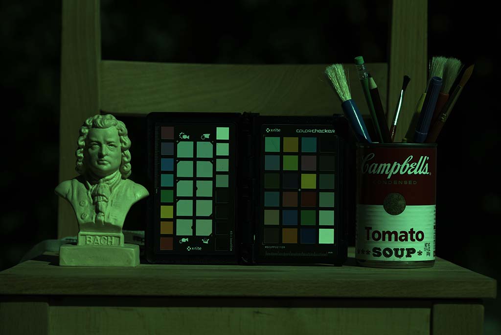
Rather dark and green.
Some of darkness, as we’ll see in a bit, is due to underexposure, but most of it is due to a mismatch between the gamma encoding of the RAW file and sRGB. Humans can generally more readily distinguish between absolute values of darker tones than lighter tones; in other words, we perceive more difference between, say, two objects that reflect 5% and 6% of all light respectively than between two other objects that reflect 95% and 96%. As a practical result, if you use a simple linear scale to denote color values, you might wind up with cases where you can spot posterization in the shadows but not the highlights. When you apply a gamma function to your mapping of actual values and the numbers you use to represent them, you wind up with more numbers between two darker values than between two lighter values, thus giving finer gradtation in tonality to dark colors than to light ones.
Of course, if you have enough bits in your image, you’re not going to get any (human-perceptible) posterization regardless of the gamma encoding, but more bits means bigger files and slower processing. The gamma function allows more efficient use of the bits you have.
What’s going on in this image is that sRGB is telling the computer that the image has been gamma-encoded and so the opposite of the gamma function should be performed to display the data. But, of course, there hasn’t actually been any gamma function applied to the data, so we wind up with the overcorrection that concentrates too much data in the dark areas.
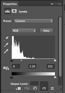
That means that our first step is to go ahead and apply a gamma curve to the image. Fortunately for us, Photoshop makes that trivial; all we have to do is apply a levels adjustment with the numerical value for the middle slider the same as the gamma encoding used by our color space. Most color spaces, including sRGB use a 2.2 gamma, which is what we’ll use here; notably, however, ProPhoto and some other color spaces use a 1.8 gamma, which is what we’d have to use if that was the color space we had assigned to the image.
Here’s what the setting for the adjustment looks like:
And here’s what the image looks like afterwards:
That’s taken care of (most of) the darkness, but it’s still awfully green.
As I discussed above, one way of understanding white balance is to separately determine what the red, green, and blue values are for an idealized white piece of paper in the scene and to (separately, individually) multiply all the values in each channel so that those values get translated into the maximum value. As it turns out, the same levels control we just used to set the gamma also has the ability to do just that. All we need now is to know what RGB value corresponds to that ideal white and set it as the value for the rightmost slider (the clipping point) in each of the three channels.
But how to know what that RGB value is? Ay, there’s the rub. If you had such an ideal sample in your image, you could look at what its RGB values are and use that — and that’s just what using the eye dropper white balance tool does in most RAW development egines. Except, of coures, it doesn’t require you to pick something that’s pure white but anything that’s (theoretically) neutral, and it does the necessary extrapolation for you.
The problem is that nothing is actually white enough to get the white balance perfect. Some things come close; for example, the styrofoam in a coffee cup, assuming it’s never been used for coffee, is actually closer to a perfect very light gray than any white balance target on the market that you can buy today for less than a thousand dollars. But even the best, scientific grade white balance targets are only going to get you a good approximation of the white point.
If it’s perfection you want, you actually need to build an ICC profile of the RAW, unmodified image, and ask the profile what it thinks the white point is.
I should first hasten to add: we’re not going to actually apply this ICC profile to the image. We’re just going to use the very sophisticated and precise math in a good modern ICC color profiling engine to determine what the white point is, and the easiest way to do that is to build an ICC profile (that we could apply to the image, but you don’t get the best of results with that direct approach).
My ICC system of choice is Argyll CMS. It’s free and it’s excellent. The catch is that, like dcraw, it’s a command-line utility. There are other options, especially from X-Rite, that have a pretty user interface but which aren’t cheap. If you’re serious about fine art reproduction or other photographic applications where by-the-numbers, you’ll be buildidng lots of ICC profiles of various devices for all sorts of reasons. If building an ICC profile isn’t an option, I’ll later show the best way to come close to the same results, but it’s more time-consuming and prone to error — though nowhere near as prone to error as other popular methods of normalizing white balance and exposure.
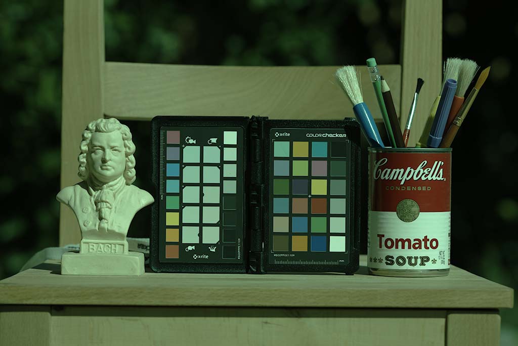
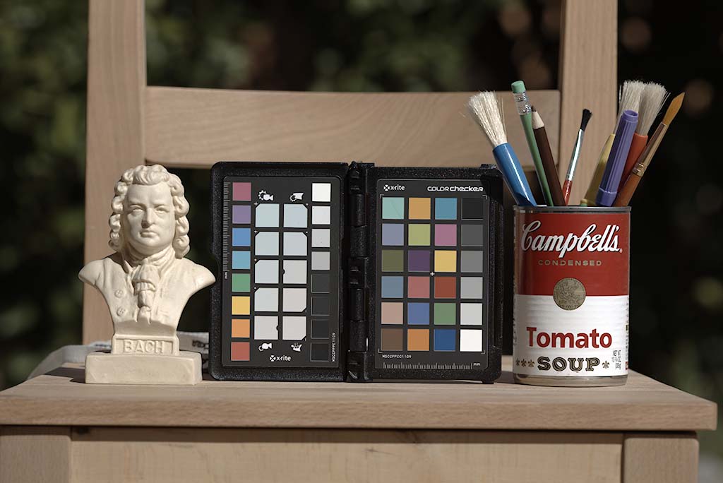
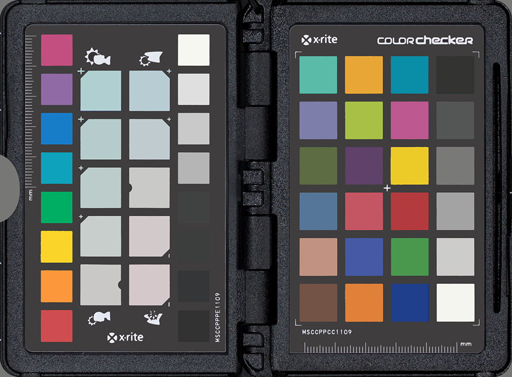
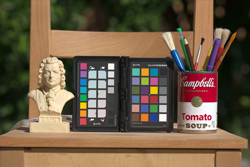
So, the first step is to crop the image so it only contains the color chart. I obviously included the ColorChecker Passport in the still life for a number of reasons, not the least of which is because it’s a familiar, well-known colorful object. However, it’s also the ultimate white balance and exposure tool for field use. Where most photographers would shoot a gray card of some sort, I’ll instead shoot the ColorChecker; you would then (or previously) shoot the scene with the same camera settings without the ColorChecker. You can use any chart for this purpose, but you’re not going to find a better chart for use in the field; it’s got more patches with a wider gamut and a more useful distribution of colors than anything else, plus it’s in its own protective case.
Once cropped, you feed the image to the patch recognition application which identifies each of the patches and calculates the average RGB values:
scanin -G 1.0 _06C3215.tiff ColorChecker\ Passport.cht ColorChecker\ Passport.cie
That tells Argyll to assume a gamma of 1.0 (not vital but it helps speed things up) when reading that file, and to look in the .cht file for the chart layout information and the .cie file for the absolute color values. (Those two files are supplied with the latest version of Argyll, or you can supply your own by measuring your own ColorChecker with your own spectrophotometer.) Argyll does its magic and writes the RGB and absolute color values to a .ti3 file, which is the file format Argyll uses to actually build a color profile.
There are many different types of color profiles. For determining a RAW digital photograph’s white point, the best type is a matrix profile, even if you have a chart with a high patch count:
colprof -a m _06C3215
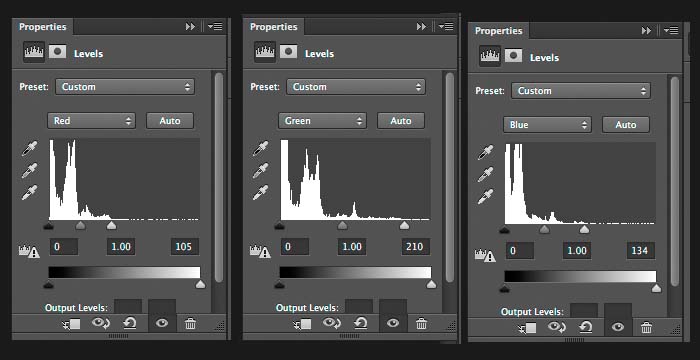
After a second or two, we have our sniny new ICC profile, and we can finally ask it the big question we’ve been building up to: what RGB values in a file tagged with this profile will give us L*=100 a*=0 b*=0?
xicclu -v 0 -s 255 -f if -p l -i a _06C3215.icc
We are presented with a blank line waiting for us to type in our Lab value:
100 0 0
And the oracle replies:
104.504305 210.284299 133.532581
We now, finally, go back to Photoshop and alter our earlier levels adjustment (the one where we set the gamma), and set the clipping point for each of the channels to their respective values:
…and the result is this:
If you compare the ColorChecker in the above image with this synthetically-created one below, it should be obvious at this point that we do, indeed, have absolute perfect white balance and exposure — though, of course, the image is much less saturated than it should be. This is because the camera has a much larger color gamut than sRGB — but I’m getting ahead of myself.
It’s actually possible to re-create the basic idea of a simple ICC profile in Photoshop, though it’s way too much work and the results aren’t at all worth the effort. It is worth doing, however, at least once, just to get a visceral feel for the sort of thing that’s going on.
What you’ll need is an image with a ColorChecker and an exposure that’s been properly normalized as described above, as well as an idealized synthetically-made image of a ColorChecker with perfect colors, such as the one above. Put the synthetic ColorChecker in a layer above the photograph, and scale and align (and perhaps apply perspective distortion) so they perfectly overlap. Set the blend mode of the synthetic version to "Difference." Then, add a Hue / Saturation adjustment layer to just the photograph, not to the synthetic ColorChecker. Now, go through each of the color options and fiddle with the three sliders for each color until the corresponding patches are as black (and as neutrally-colored) as you can possibly get them. The final result will look something like this:
Which is actually not all that bad — and actually better than anything you can get with even the best workflow with most RAW development engines.
Now that you understand the slow, laborious, tedious, imperfect, but representational manual method of developing RAW images, let me show you what I actually do do.
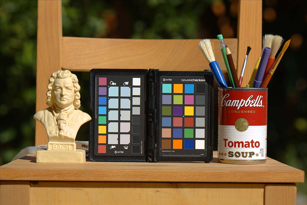
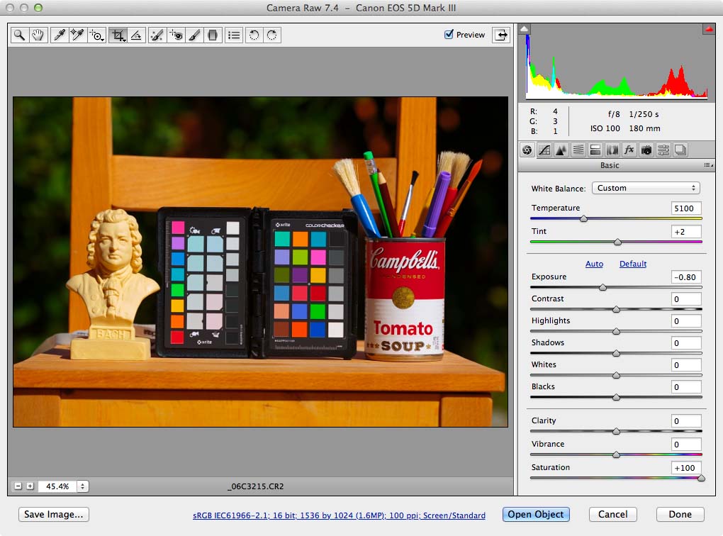
It starts off in Raw Photo Processor with the following settings, which creates a TIFF indistinguishable from the one we originally created above with dcraw.
I then feed that TIFF to a clumsy short little Perl script I kludged together to run all of the profiling, etc. commands. Amongst other things, instead of outputting RGB values, it outputs EV (exposure value) adjustments, which is what Raw Photo Processor uses for setting the individual channel exposure adjustments (aka, "white balance"). If you don’t remember your high school math, scale the RGB values from xicclu to 100 instead of 255 ("-s 100"). Divide 100 by the value in question; take the logarathim of the result; and divide that result by the logarithm of 2. The result with this particular file is that the red channel needs to be pushed by 1.2869 stops; the green by 0.2782 stops; and the blue by 0.9333 stops, so those are the values I put into Raw Photo Processor. I also set the Gamma to 2.2, change the output to whatever working space is appropriate — almost always BetaRGB, but occassionally (such as now) sRGB for direct output to the Web — and select the ICC profile I’ve got on hand that I’ve previously built for this camera and illuminant.
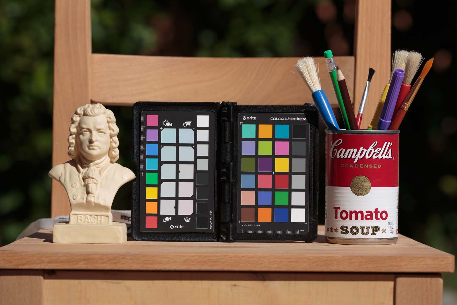
The resulting file:
If you compare the ColorChecker in that image with the synthetic one above, you’ll see that there is almost no difference between the two. And, remember — this is shot outdoors with a general-purpose ICC profile. Had I shot it instead in my studio set up for copy work and applied a profile built for that exact combination of illuminant and lens, even those small differences would have been further reduced.
You’ll have to take my word for it, but all the rest of the color in the scene is spot-on, as well. The pens and pencils and brushes look just like the real ones. The soup can’s red is actually outside of the sRGB gamut, but it’s probably also outside of your monitor’s gamut, too, anyway. (So are some of the ColorChecker patches.) Still, Raw Photo Processor did a good job of mapping the gamut in an appropriate perceptual way such that the scene on the monitor looks almost exactly like the original..
For best results, you need the best possible ICC input profile…and doing so actually presents a whole host of challenges.
If you’re not familiar with what goes into building a camera profile, the basic idea is that you do what we just did above to determine how to normalize exposure and white balance. You photograph your chart and feed it along with reference files to your ICC profiling software, and it spits out an ICC profile.
The first challenge is the chart itself. While I can’t sing the praises of the ColorChecker Passport highly enough for use as an exposure and white balance tool for field use, it’s only just barely adequate for building matrix profiles. It’s not bad for generic work — and a lot better than nothing, and far superior to typical RAW development software. And do note that I’m referring to building full ICC profiles with the full 50-patch chart, and not just DNG profiles with the 24-patch half with either the Adobe or X-Rite DNG profile building software; neither of those are close to adequate.
For critical work, you need a lot more patches and a lot more colorants. You also want an even bigger gamut.
Sadly, you cannot buy a chart that will do a good job. The ColorChecker SG is probably the best commercial option, but even it is still woefully inadequate..
Where does this leave you? With constructing your own chart.
I’ve got one that I made a year or two ago that’s served me quite well, but I’ll soon be building a second version. The first version has about 600 patches, 48 of which were painted on, another dozen or so are of special features including some of what I describe below, and the rest of which were printed on a Canon iPF8100 pigment inkjet printer on Canon Fine Art Watercolor paper. The new version will be the same basic idea: dozens of hand-applied paints plus hundreds of printed patches. The total patch count will be at least the same as the current version, perhaps more.
The old version had a painted-on classic (24-patch) ColorChecker made with paints spectrally matched at the local hardware store. Half of the remaining paints were shots of pure pigment from said hardware store; the other half were Golden Fluid Acrylics. The new version will dispense with all of the hardware store paint — the ColorChecker wasn’t a bad idea, but it’s much more useful as a standard universal reference than as something to incorporate into this chart. Instead, I’ll be using not only more Golden Fluid Acrylics paints, but I’ll be making tints of each (most likely, 100%, 75%, 50%, and 25% mixtures of pure paint with white).
Rather than a matte finish, I’ll be using a glossy finish. I’ve yet to test enough candidates for a final decision, but one of the leading contenders is Canson’s Baryta Photographique: it’s free of fluorescent whitening agents and has a good-sized gamut. Properly photographing a glossy chart presents challenges, but those challenges can be solved — and I’ll describe below how to solve them.
The old chart is mounted on top of an hollow box lined with black flock velvet fabric, and there’s a patch-sized hole cut in the top. The result is what’s called a "light trap," and it’s almost perfectly black. The new chart will have something similar. The next darkest neutral patches on the old chart are a couple of the Golden Fluid Acrylics, and there isn’t anywhere near enough representation of near-black values on the old chart. The new one will partly address that shortcoming with the use of glossy stock with its larger color gamut, but I’m also investigating other options for dark black pigments, including artist’s paints as well as even exotic paints that use carbon nanotubes.
At the other end ofthe lightness scale, the old chart has a patch made of some PTFE (Teflon) thread seal tape folded over upon itself several times; it’s as close to 100% neutrally reflective with a flat spectrum as makes no difference for this application. There’s also a piece of Tyvek (you can buy envelopes made of the stuff at your local office supply store), which is just an almost-imperceptable hair’s-breadth shade darker. The lightest of the paints is about as much darker still; the paper white is again that much darker; and then the inkjet-printed gray step wedge takes over from there. The new chart will be very similar in this regard, though I’ll have to do a better job at folding the PTFE thread seal tape more neatly.
The old chart has a number of wood chips on it. I’m undecided on whether the new one will, or how many if so.
On the old chart, the printed patches I generated wtih Argyll’s default patch generation parameters. For the new one, I’ll instead distribute evenly in perceptual space.
And, lastly, I’ll be making a cover of some sort, and probably an additional all-white something-or-other to use for light field equalization (about which I’ll discuss more in a moment).
Constructing such a chart takes a bit of time. After you’ve physically assembled it, you then need to read each of the patch values, one by one, with a spectrophotometer. You then need to put those values together in the proper chart recognition files. However, once you’re done, you can use the chart for as long as you don’t damage it. Should you suspect fading or other types of color changes, you can always re-measure the chart and use the new values. Or, you can — as I have — decide to make a new and improved chart once you understand the shortcomings of the old one.
(I should add: I get very, very, very good results with the chart I have today. The improvements I expect with the new chart will be marginal at most.)
I’m sure, when I mentioned above that the new chart will be glossy, that all sorts of alarm bells immediately started going off in the minds of all photographers experienced with this sort of thing. Conventional wisdom, for good reason, says that glossy charts are nothing but trouble.
But the thing is, a matte surface is just a very finely textured glossy surface. Light from all angles gets reflected at all angles by the glossy surface, adding white light to the color and thereby reducing its purity and therefore saturation. A glossy surface, on the other hand, is (mostly) an all-or-nothing affair; either you see the pure color or you see the reflection of the light source.
The problem with photographing a glossy chart for color profiling is that the typical lighting setups for copy work have geometries that will produce specular reflections on glossy surfaces.
Indeed, any photograph of a glossy object will have specular reflections — but not in all portions of the frame. And the key to photographing a glossy chart is understanding the geometry of specular reflections.
Imagine a camera positioned parallel to the chart. Imagine a single light source to the camera’s left, pointed at a standard 45° angle to the center of the art. Everything on the left side of the frame is going to have some sort of specular reflection, but nothing on the right side of the frame is going to have any specular reflection. The standard copy setup adds another light on the right (and possibly even more equidistant from the art) to even out illumination; this light will produce specular highlights on the right side of the frame, but not the left. Use both lights, and you get equal specular highlights in both halves of the frame — and thus the bad reputation of glossy charts.
The solution is to position the chart entirely in the half of the frame that won’t produce specular highlights. (The alternative is to use a lens with movements, such as a Canon TS-E lens or a Nikon PC lens. But that’s mostly only useful when profiling those lenses themselves.)
Right about now, another different set of alarm bells is going off in the heads of those with experience in these matters. The whole reason multiple lights are used is to ensure even illumination across the scene; by using a single light, there will be significant light falloff from the one side of the frame to the other.
There are a few solutions to this problem.
The first one is more of an observation useful for general-purpose profiles: sunlight displays no such falloff characteristics; this isn’t a problem when profiling the camera for actual outdoors daylight.
But, back in the photo studio, there are two things to do to solve the problem of uneven illumination, both of which are sufficient unto themselves but which should be combined for optimal results.
First, if you’re serious about fine art reproduction, you should already be using Robin Myers’s superlative EquaLight to minimize any variations in illumination in the scene. Even with perfect illumination and the best lenses you can buy, there’s still a bit of light falloff, and EquaLight will correct for even dramatic levels of uneven illumination. Simply photograph a featureless white surface — quality fine art paper without optical brighteners works great — and feed that image as well as the actual shot (or shots — EquaLight does batch processing) to EquaLight, and it will analyze the unevenness in the former and apply the inverse to the latter to make it as if your lighting and lens truly was perfect. And, again, EquaLight is more than up to fixing the level of uneven illumination caused by only lighting the chart from one direction.
Next, if you rotate the chart in place 180°, not only will the unevennes in illumination be the inverse, but any remaining specular highlights (such as from raised surfaces due to imperfect brush technnique) will be rendered without the highlight (and corresponding new highlights will now appear on the opposite side of the bump or ridge or whatever). If you rotate the second shot in Photoshop, layer it over the first one, align the two, make a smart object of the two, and set the blend mode to Median, the result is again perfectly even illumination.
As I noted, you should do both.
You will, of course, want to follow the process I outlined above for normalizing exposure and white balance before outputting an untagged file for building the real profile.
In the past, I would typically start each scene I shot in the studio with a photograph of the chart, and I’d build a profile for that scene with that shot of the chart. The idea was that, by doing so, I’d compensate for any casts caused by reflections or the like.
That theory sounds nice, but I’ve since realized that things don’t actually work as well as they can that way. In particular, the lighting geometry ideal for profiling is nothing like what you actually use in the studio, even for flat copy work and especially for three-dimensional objects. Worse, removing such color casts with an ICC profile leads to unnatural results; instead, you either actually want (for example) the reflections to have the color of what they’re reflecting, or you want to eliminate whatever’s causing the reflections in the first place.
As a result, I’m now carefully building profiles for the actual combinations of camera, lens, and light source that I’m using. For example, I’ll line up all four of my Einstein flashes in a tight array at one end of the studio, aim them at the chart several feet away, and photograph the chart in the far half of the frame. My studio is a black box (walls and ceiling lined with black flock velvet curtains and a black vinyl backdrop rolled across the floor, with the art typically going on the floor and the camera suspended above it), so the resulting photograph only has the lights and the lens and the camera contributing to the color — exactly what I want.
I’m also experimenting with a general-purpose profile made in daylight with a pinhole lens. The idea is that I’ll use this for any landscape or other outdoor photography. Any color casts imparted by the lens I’ll consider as part of the character of the lens; such casts are minor to begin with with quality lenses and not objectionable in artwork. When I’m shooting outdoors, absolute colorimetric accuracy isn’t what I’m going after, though I do generally want it to be very, very close. The first experiment with the pinhole lens shows promise, but there’s a bit of flare and loss of contrast that leads to excessive contrast (and loss of shadow detail) in the resulting profile. I think I know where the problems lie…maybe….
Anyway, I would caution against my old practice of a profile for every scene and instead encourage profiles at least of camera / light combinations (using either no lens or a very high quality lens or the lens you’ll be using the most), and of camera / light / lens combinations for the most critical of work. If you get new studio strobes, re-build your profiles. If you never shoot in fluorescent light (or if you don’t care so much about accuracy in such conditions), don’t bother building a profile for fluorescent light.
If, for whatever reasons, you can’t use an ICC-based workflow to develop your RAW images and instead are limited to one of the popular RAW development engines, there are still some fairly straightforward adaptations of the principles I’ve outlined above that may well constitute a "good enough" or "80/20" solution for those wanting more accurate color.
The first is to still shoot the ColorChecker Passport (which, as you’ll soon see, is ideally suited for this purpose) in every scene. You’ll use it (but not in the popular manner nor in the ICC-based way I described above) to normalize white balance and exposure, and it’ll give you the option in the future of revisiting the images and using an ICC-based workflow to perfect the rendition. You’re also going to use it to build a DNG profile which, though woefully inadequate for reproduction work, is still much better than the defaults.
I’ll use Adobe Camera Raw for the remaining examples. The same basic principles apply in most other RAW development applications.
Before you begin, you need to set everything to its most neutral position — and that applies to all the development tabs. In particular, the default tone curve is generally set to "medium contrast"; you want "linear." Also set the camera profile to either the one you made yourself (and I’ll discuss how best to make one) if you have it, or "Camera Faithful" if not. Save these neutralized settings as a preset for easy access in the future.
Start by cropping the image so it just shows the ColorChecker. The rest of the image is a distraction at this point that you don’t want to concern yourself with.
Then, use the eyedropper on any of the neutral patches to get the white balance in the ballpark. You’re not looking for perfection at this point, or even anything you’d settle for; just something not too terribly far off.
Next, use the expoure slider to adjust the image until the N5 gray patch (the one next to the yellow patch) has roughly (within shouting distance) of the proper RGB values for your working space — that would be 122 for 2.2 gamma workspaces (everything but ProPhoto) and 102 for 1.8 gamma workspaces (ProPhoto). (And, yes, that’s slightly brighter than 50% gray.)
Now, the precision adjustments start. Crank the saturation slider to its highest setting. The chart very likely looks quite ugly. Your goal is to adjust the white balance until it’s the least ugly you can get it, In particular, pay close attention to the near-neutral "creative white balance" patches on the left, and especially to the actually neutral patch in the middle of the landscape set. Do whatever you have to to the two sliders to make that patch have a neutral color midway between the yellowish and bluish patches above and below it. It helps to have a synthetic version of the ColorChecker (such as the one up above) open at the same time for visual reference.
When you’ve got the ColorChecker as neutral as you can make it, have another look at the exposure, and re-adjust it as necessary. Then, bounce back and forth between the two adjustments — white balance and exposure — until you reach the point of diminishing returns. It should look something like this:
Finally, return the saturation back to normal. You’re left with something like this:
…which isn’t quite as bad as what the defaults give you. There’s still way too much contrast and saturation, which at first glance gives the image more "pop"…but, at second glance, the shadows are completely blocked up and there’s no highlight detail — which is exactly the result one would expect from increased global contrast. There are also some hue shifts, and differential saturation and value between hues.
When you build your DNG profile, the first thing you’ll want to do is use the same lighting geometry as I described above. The daylight exposure is easy; just shoot it outdoors on a clear day during lunchtime. The tungsten exposure is more of a challenge because you don’t have any way to equalize unevennes in illumination across the frame. You can minimize it, however, by putting as much distance as possible between the target and the light source. Fortunately, the chart is small enough that the differences are minimal to begin with.
When you normalize white balance and exposure, you actually don’t want to use the slider to get the exposure perfect; you want to re-shoot the image until the straight-out—of-the-camera shot has perfect exposure, or else you’ll bake in a corresponding amount of exposure correction in all your shots with that profile. And you’ll want to be as painstakingly tedious in adjusting the white balance as you possibly can to truly nail it perfectly.
I’ve had the best results (quite some time ago when I was banging my head against this particular wall) with Adobe’s DNG Profile Editor. Load your shot into the program, make sure the “apply ACR adjustments” (or whatever the menu item is called) is selected, and build the color tables from the chart by placing the dots on the patches. The next challenge is to build a custom tone turve that neutralizes the baked-in contrast enhancement. If I remember right, three control points is the right number, starting with one for the midtones and then adding one each for shadows and highlights to refine its shape. One might be tempted to add as many control points as possible, but that leads to some rather nasty posterization. You’ll need to use something such as Apple’s Digital Color Meter to compare the onscreen values to know when you’ve made the proper adjustments; just eyeballing it isn’t very accurate.
So, that’s an awful lot of information to spew onto the Internet. Too much, I’m sure…but, my hope is that whatever particular bit of information you came here looking for you actually found.